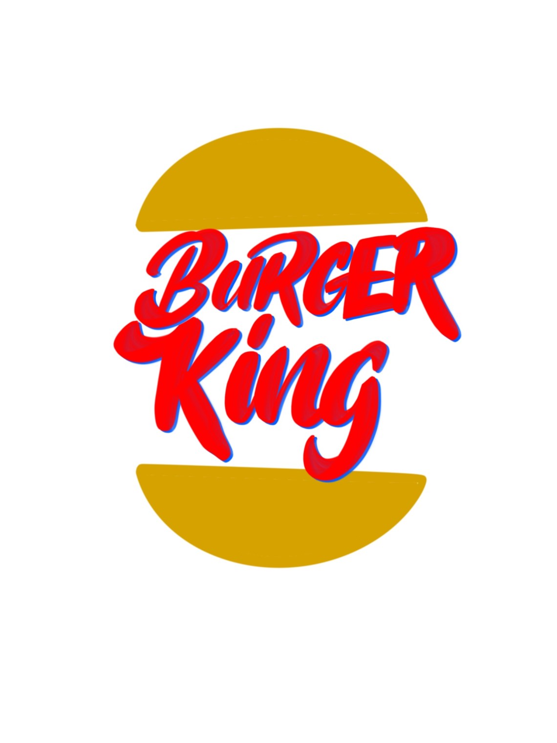
Day 1 was to design a logo for a Burger Joint. I decided to go for a more modern feel to burger king. Because I feel its a brand that needs to help nowadays.
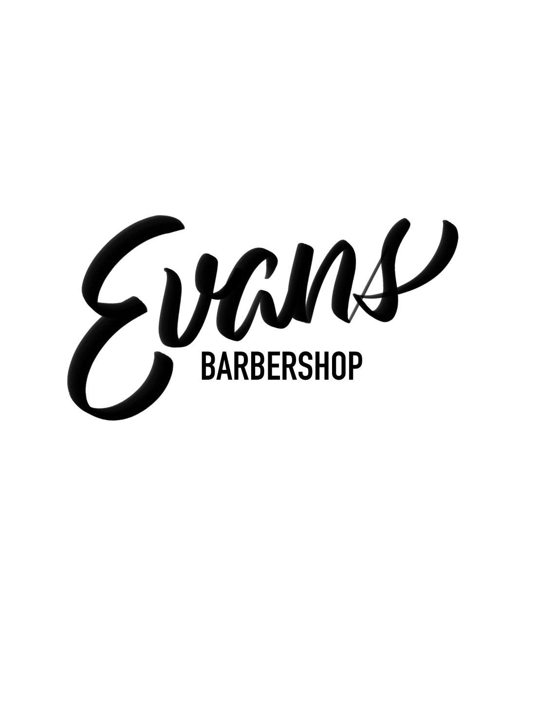 Day 2 was to design a logo for a barbershop and or a Hair salon. Based on the research I did was to keep the logo nice and legible.
 Day 3 was to design a logo for a doggy day care. I thought of keeping it fun and loose using an illustration of a doggy as well as nice bold type.
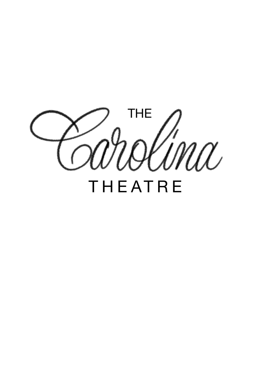
Day 4 was to design a logo for a community theater group. I redesigned the logo for the Carolina Theatre in Durham NC. Based on its history and how much of an impact it has on the community.
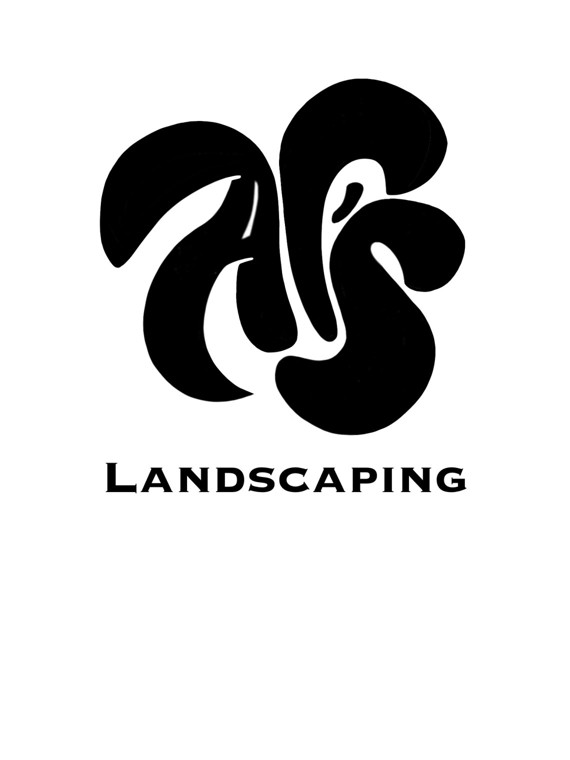 Day 5 was to design a logo for a Tree service and or a Landscaping service. The brand name is Al’s Landscaping. I compacted all of the letter’s together to make it a mark that would be easily transferred to be used on shirts, vehicles and etc.
 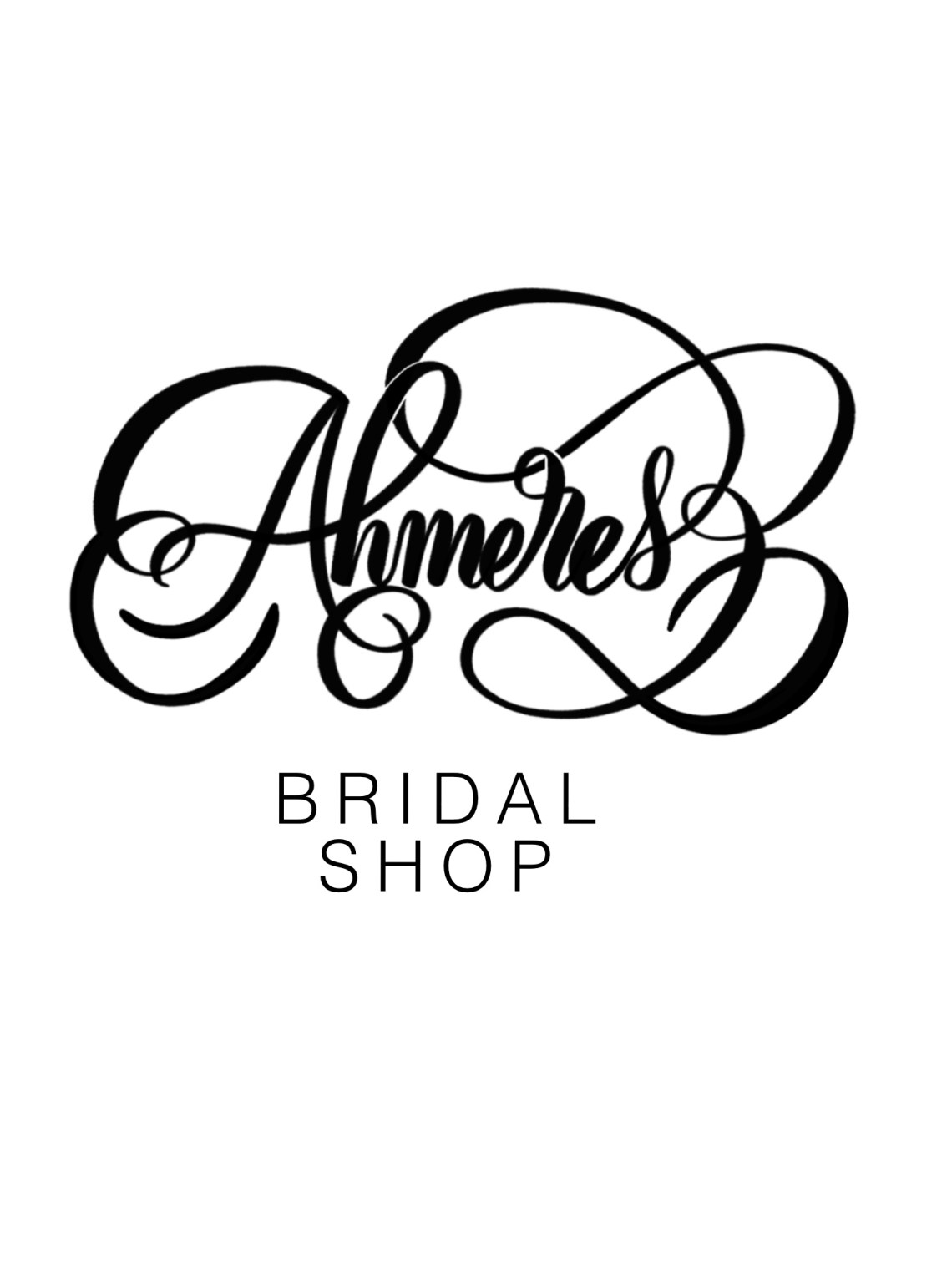 Day 6 was to design a logo for a bridal Dress Shop. The flourishes symbolize a nice and fancy location. As well as not making the name (Ahmeres) of the shop eligible.
 Day 7 was to design a logo for a city. Since I am currently living in Pembroke Pines Florida. I used a palm tree and wanted to focus on making the logo easily identifiable for locals and tourists who visit.
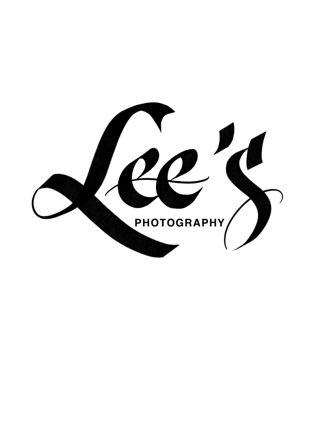
Day 8 was to design a logo for a photographer or studio. I decided to design for a photographer and wanted focus on the creativity the photographer’s posses with their cameras and etc.
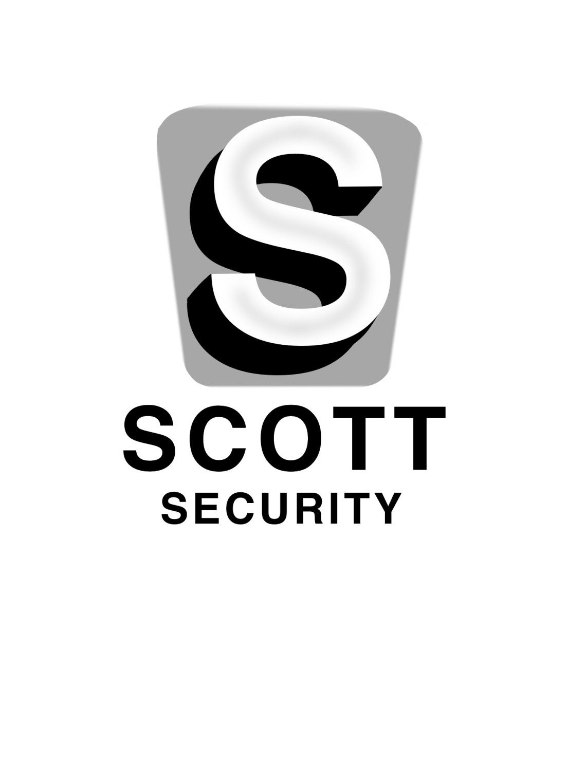 Day 9 was to design a logo for a security company. Seeing all of the logos for a security companies the bold type and simple colors make bold statements.
  Day 10 was to design a logo for a Pumpkin Patch. I had fun creating this logo and visualizing how easy this would be able to be transferred to a sign painted in front of a pumpkin patch and etc.
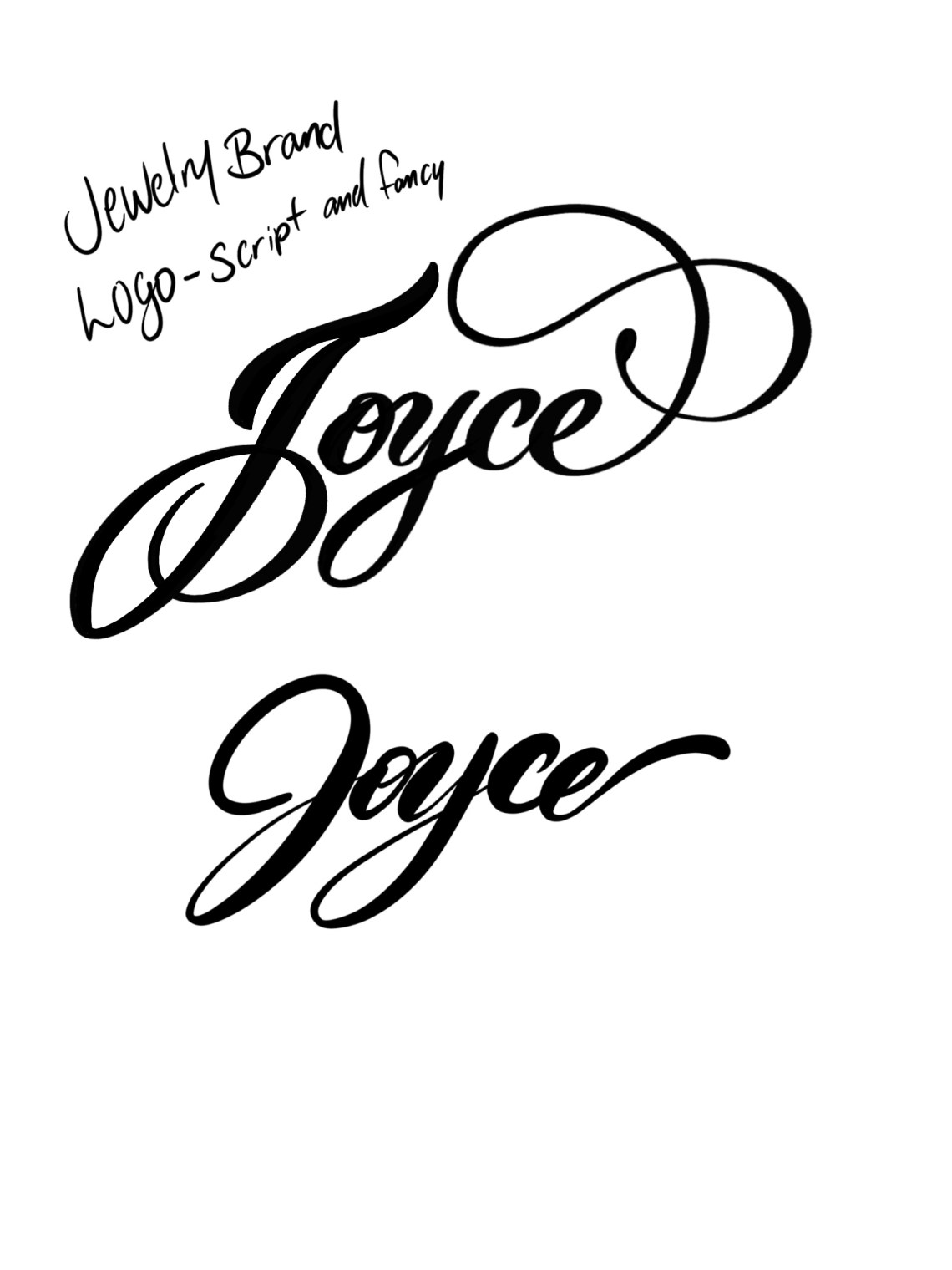 Day 11 was to design a logo for a high fashion jewelry brand. I focused on not over doing the flourishing and keeping the type nice and clean.
 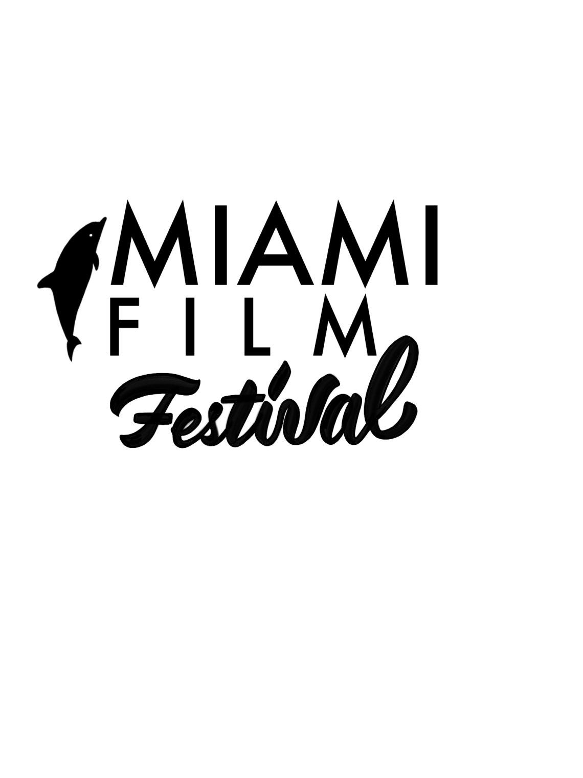 Day 12 was to design a logo for a film Festival. I created one for a mock film festival in Miami Florida.
Day 13 was to design a logo for an Architectural designer or Firm. I focused on using 3 letters for the design firm and not using any other type. 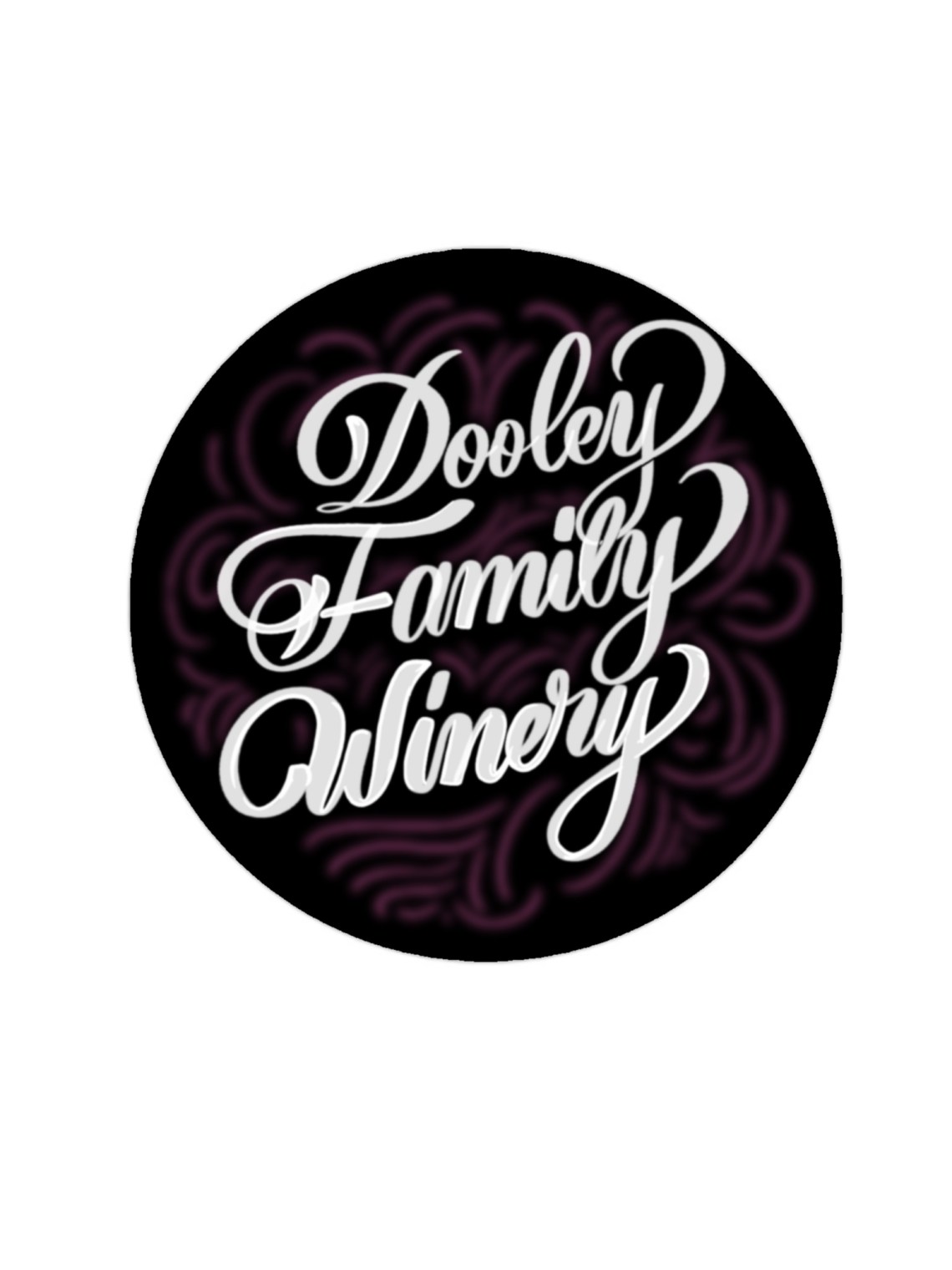

Day 14 was to design a logo for a winery. I designed a mock brand for my family and focused on how easy it would be for the customer to see and notice the logo over others on the shelf in the store.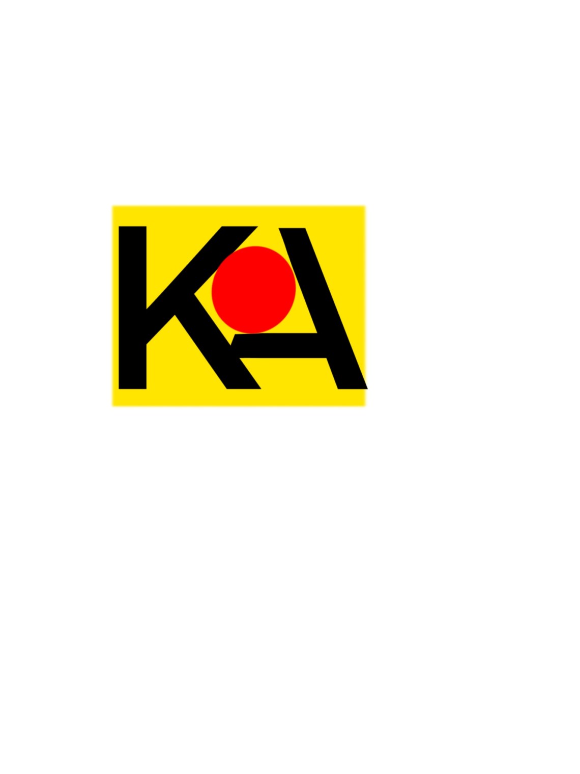 Day 15 was to design a logo for a campground. I redesigned a local campground KOA located in Hollywood Florida.
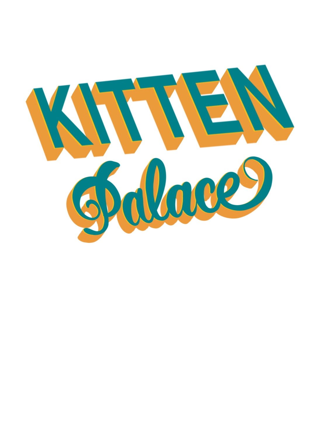
Day 16 was to design a logo for a cat cafe. I decided to go with the name Kitten Palace for a cat cafe.

Day 17 was to design a logo for a organic baby food. Based on how organic branding is done I wanted to focus on keeping it minimal as possible. 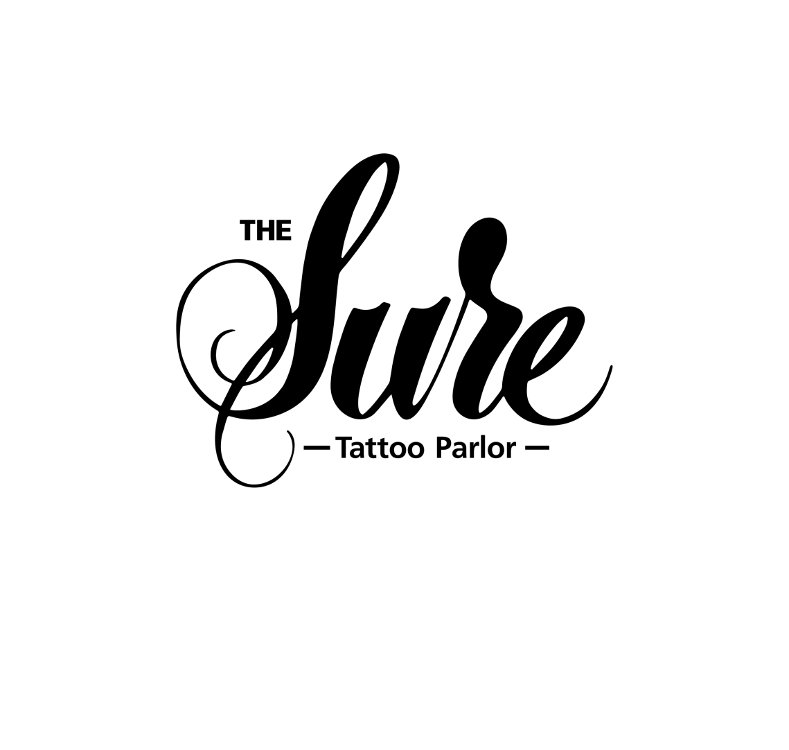 Day 18 was to design a logo for a tattoo parlor. I decided to go for the name of the Tattoo parlor called the Sure. Because getting a tattoo is something that you’d have to be sure of.
 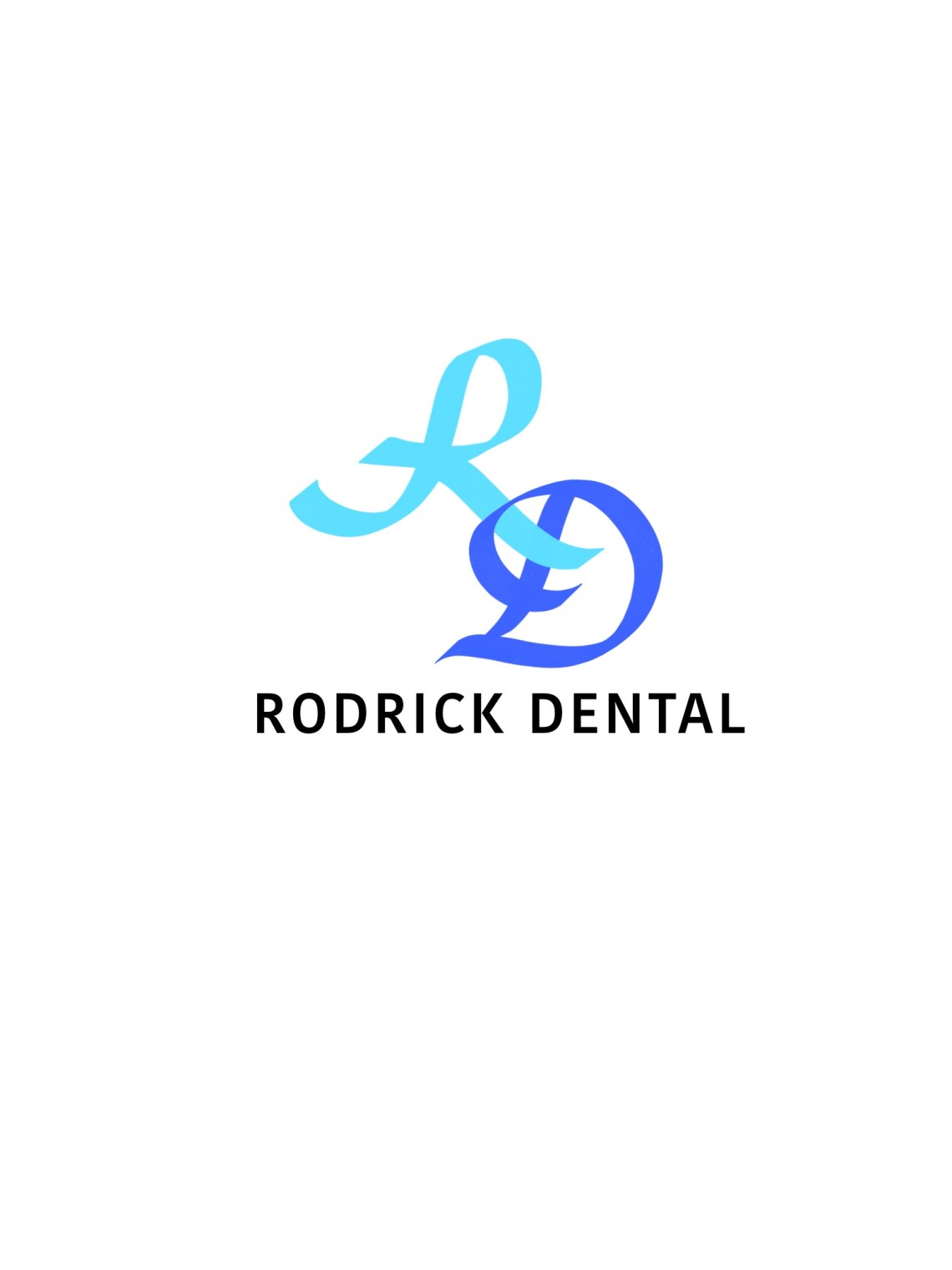 Day 19 was to design a logo for an orthodontist and or dentist. I decided to go with designing for a dentist.

Day 20 was to design a logo for a yoga studio. A yoga studio is something that is minimal and comforting.
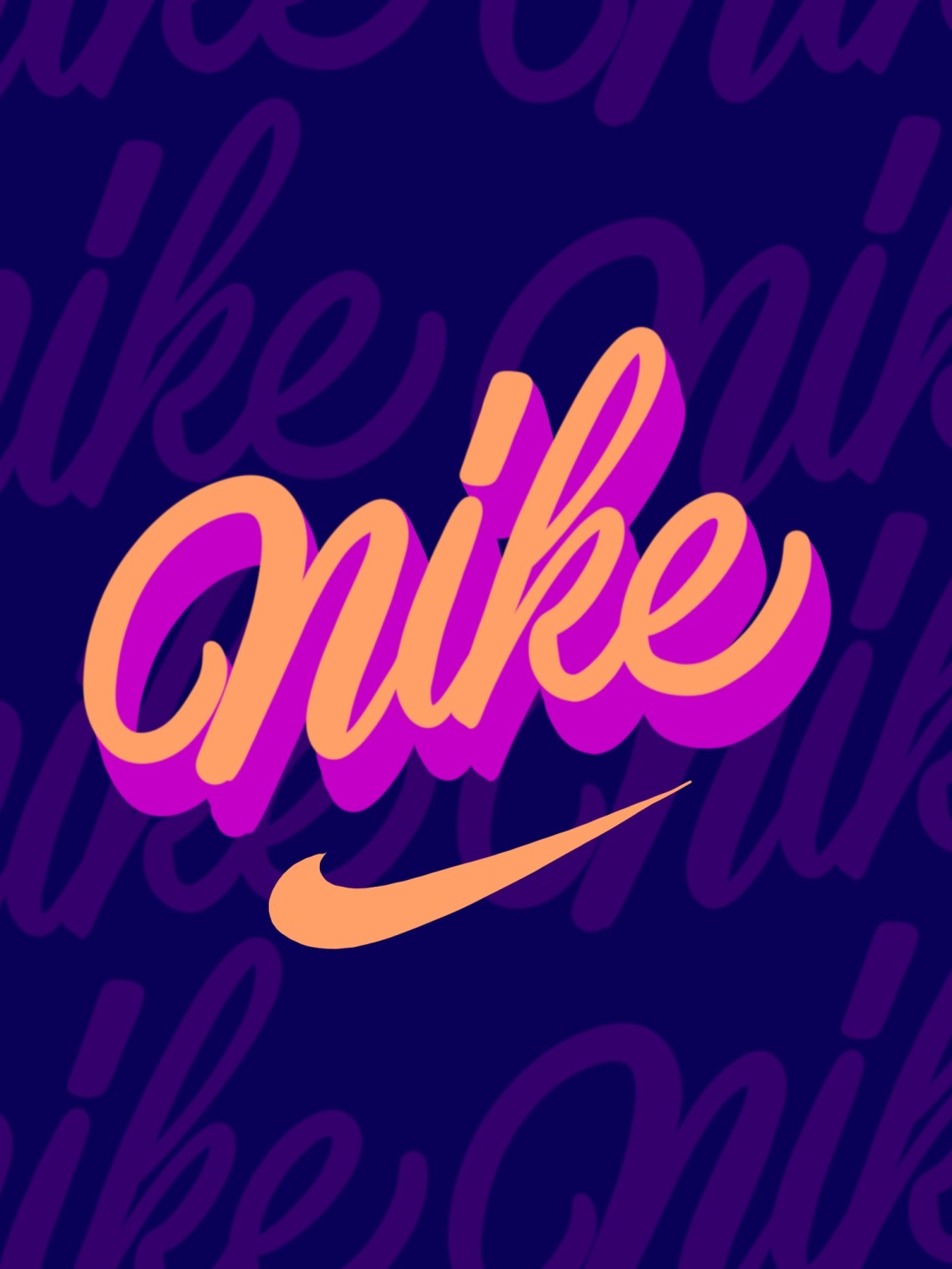
Day 21 a logo for an athletic shoe company. I did my version of the vintage nike logo.
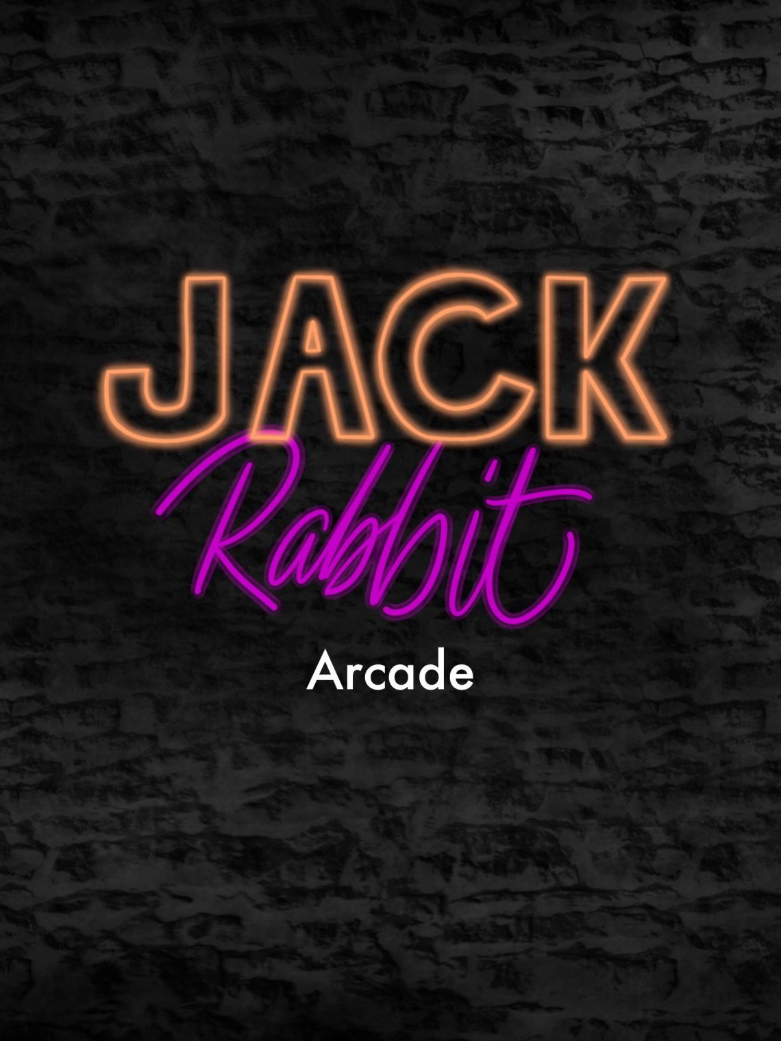
Day 22 was to design a logo for a vintage arcade. Every time I think of an arcade Neon is what I think of instantly. 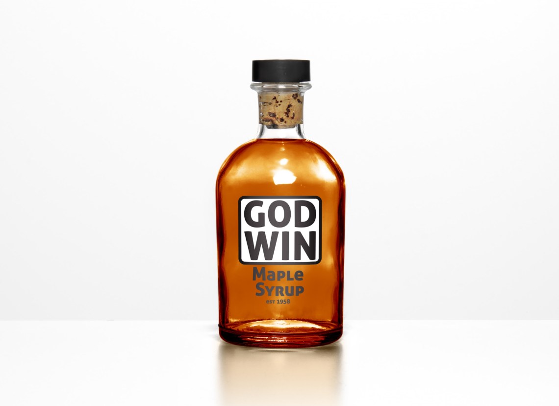 Day 23 was to design a logo for Maple Syrup. While creating this logo I wanted to focus on the Maple syrup and how it would be presented on the shelf in grocery stores and etc.
 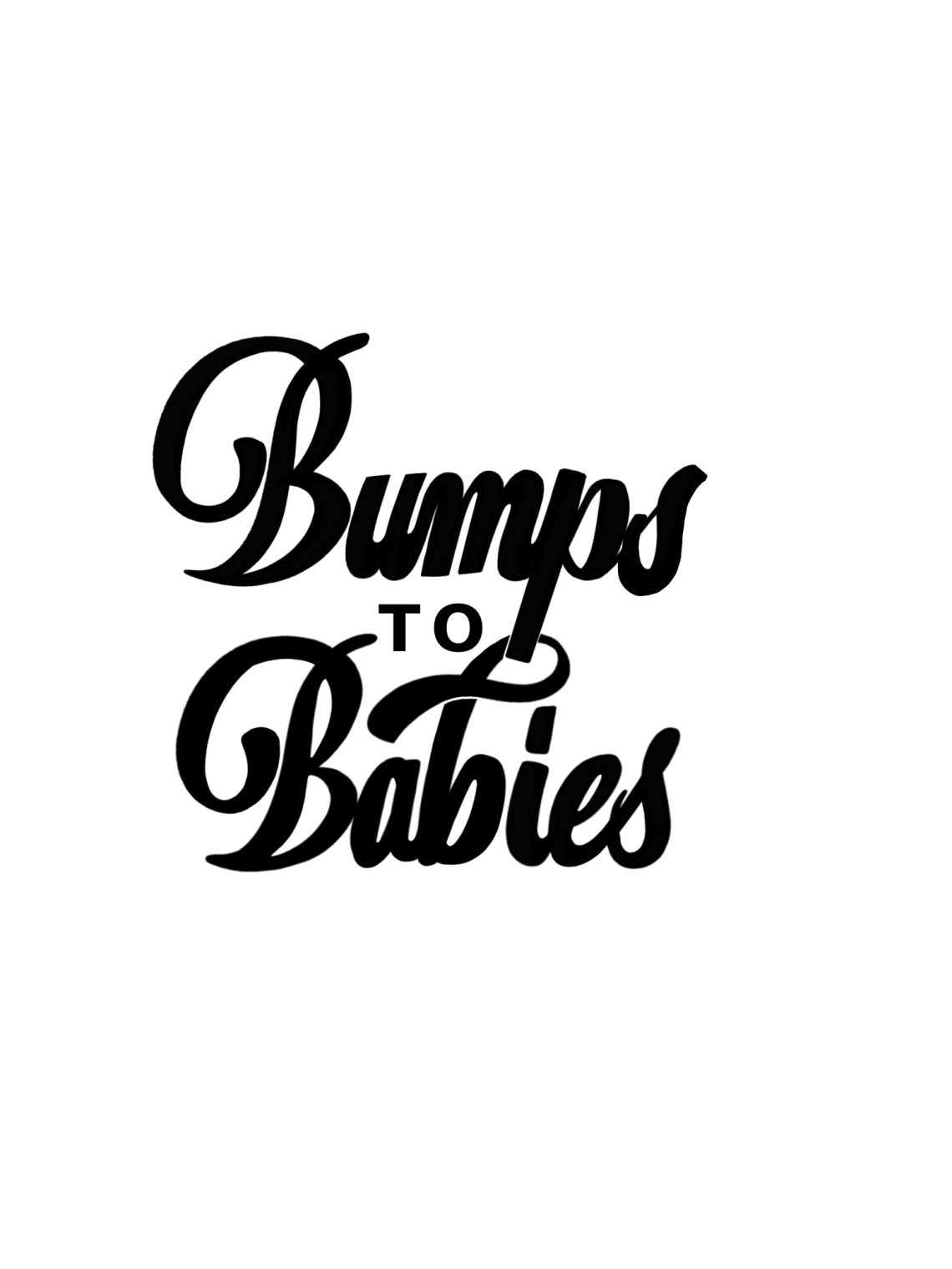 Day 24 was to design a logo for maternity clothes. While doing research I came across the name bumps to babies and felt this would be a great name for a maternity clothing brand.
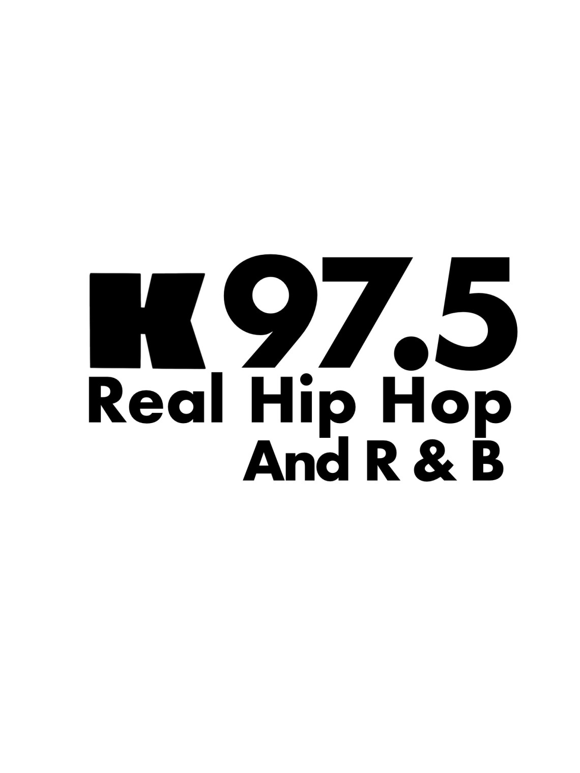 Day 25 was to redesign a logo for a podcast or radio station. I decided to redesign/clean up the logo for a radio station in North Carolina called k97.5.

Day 26 was to design a logo for a Ski Resort. While creating this logo I was focusing on a Retro aesthetic.

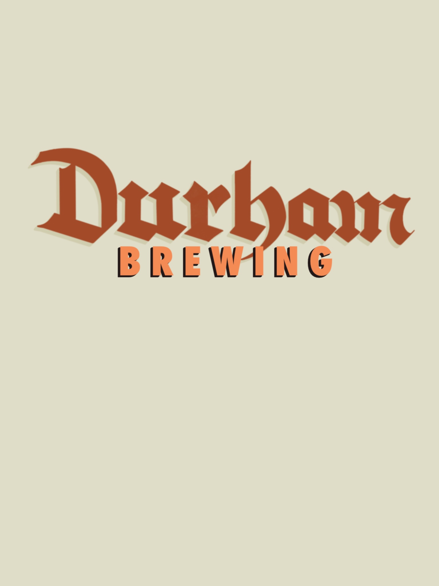
Day 27 was to design a logo for a Brewery. I decided to do a logo for a brewery that could be based in Durham NC.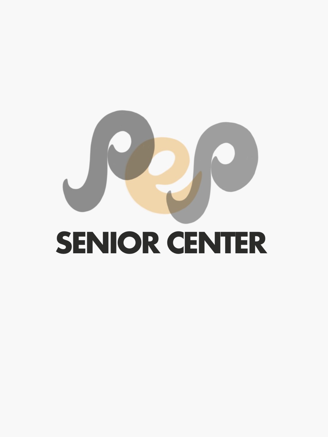
Day 28 to design a logo for a Senior Center. I decided to focus on a Monogram with the Letters PEP which means people enjoying people.
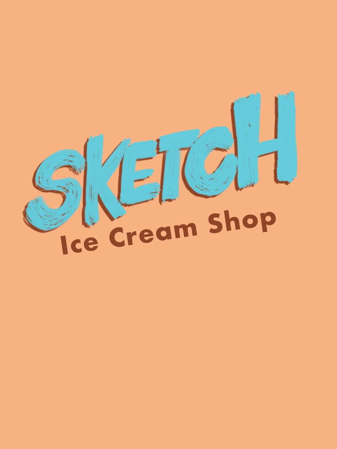
Day 29 was to design a logo for Ice cream or Frozen Yogurt. I decided to go with designing a logo for an ice cream shop. I had a great time finding the name for an ice cream shop called sketch.
Day 30 this was my first attempt to try using the golden ratio designing logo. I will definitely use this more often.
Discover more from
Subscribe to get the latest posts sent to your email.
